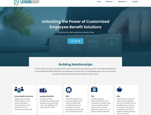
Responsive Web Design is the latest way to design your website. It caters to not just a desktop computer or laptop, but all devices like your iPhone or Android and renders your website in a usable format.
Wilmington, NC: Nearly everyone has shared the same frustration: You connect to a website from your smartphone or tablet, and the formatting is so small or distorted that you decide to look elsewhere.
That’s where Responsive Web Design, rated by Net Magazine as one of the two most important web advances in 2012, comes to the rescue!
Impact Media – – one of the most innovative website design firms in the Cape Fear Region, is using Responsive Web Design to help its clients garner new business from the web, particularly from the growing number of people searching from mobile devices. Responsive Web Design involves a new mindset when it comes to website architecture and web development techniques, and Impact Media is one of the North Carolina firms leading the way.
What’s Responsive Web Design?
“Responsive Web Design is not just about adjusting screen resolutions and resizing images,” as Brian Tucker, President of Impact Design notes, “but really about a whole new way of approaching the web development process, one that’s more fluid in nature.”
Responsive Web Design contends that a website should have the technology to automatically respond to the user’s hardware and preferences. This eliminates the need for a different design and development phase as each new smartphone or tablet enters the market.
Just as importantly, Tucker believes that the use of Responsive Web Design can improve all facets of a website’s performance – from being able to find a site, to how easy it is to navigate, to the number of site visitors who convert into customers. (The Boston Globe’s website is one of the best examples of Responsive Web Design.)
Mobile Searches Expected To Surpass Desktop Searches by 2016
The latest statistics demonstrate that Responsive Web Design is much more than a trend. A recent BIA/Kelsey Report suggests that mobile search will soon become the preferred and most frequently used method of scanning the web.
According to the study, mobile and desktop search will be equally popular late in 2014, before mobile eventually becomes the leader in 2015. By the end of 2016, mobile searches will account for at least 113 billion queries – compared to 85.6 billion from desktop devices.
More Mobile Searches Makes Mobile Marketing Even More Crucial
Tucker notes: “Making sure that your website is optimized for the mobile market – that you have a mobile strategy and that your site is appearing on mobile searches – is also crucial to your success online. In light of the rapid increase in smart device use, we’re changing our Internet Marketing techniques to serve our clients better, and we’ll continue to adapt as the way that Americans use the Internet changes.
In addition to Responsive Web Design, Impact Media is involved in the development and marketing of mobile apps for the IPad and Android markets.
Impact Media Solutions is a full service Web Design and IT company in that offers real business solutions to companies and organizations along Coastal Carolina, as well as regionally and nationally. The firm’s cohesive team of web developers, graphic designers, web copywriters, and network engineers constantly embrace emerging technologies to provide next-level affordable solutions to their clients in Wilmington, Jacksonville, and beyond. Their phone number is (910) 679-4471. More information can be found on their website: http://www.ImpactMediaNC.com.


